Tiny Text, Sharp Stitches: How Detailed Can an Embroidered Logo Be? (Wichita Guide)
How small is too small for embroidery? In this Wichita-focused guide,
U.S. Logo explains stitch types, minimum sizes, fabric effects, and digitizing tips so your logo stays crisp on hats, polos, jackets, and bags.
Want us to review your art? Call (316) 264-1321 or contact U.S. Logo.
Visit us at 520 N West St, Wichita, KS 67203.
Short Answer
Embroidery handles clean, compact logos well, but super-fine details need smart adjustments.
As a practical guide, aim for a minimum text height of ~0.2–0.25 in (5–6 mm) on hats and ~0.25 in (6–7 mm) on polos.
Keep stitch columns ≥ ~1 mm and avoid hairline serifs. When designs drop below these limits, we’ll simplify or build a small-format logo variant.
Explore decoration options on our Apparel Decoration overview.
Stitch Types & What They Do
- Satin stitch – Shiny, durable columns for letters and borders. Best for small/medium text & shapes.
- Fill (tatami) – Textured fills for larger areas; use for big marks or blocky shapes.
- Running (walk) – Fine lines & underlays; good for hairline accents but not for tiny filled letters.
Pro tip – Many “too detailed” logos become crisp when we swap fills for satin, bump column width, and rebalance densities.
Minimum Sizes, Line Weights & Fonts
- Text height – Hats 0.2–0.25 in; polos 0.25 in+ for reliable legibility.
- Column/line weight – Keep stitch columns around ≥ 1 mm; avoid hairline scripts.
- Fonts – Bold sans serifs and block caps read best. If you must use script, increase size and spacing.
- Spacing – Add a touch of tracking; tight counters (e, a, o) tend to fill in at small sizes.
How Fabric & Placement Change the Rules
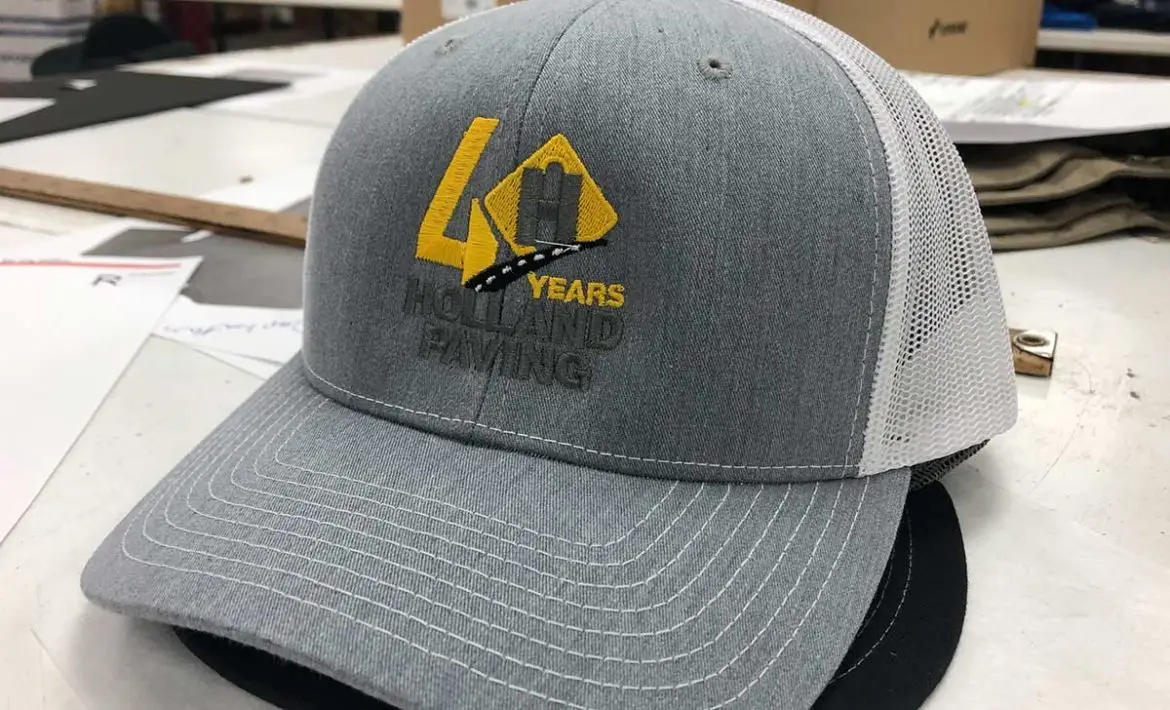
- Caps – Curved, structured fronts tend to pair with bolder columns and simple shapes.
- Piqué polos – Knit “valleys” can swallow detail, use topping and slightly larger text.
- Fleece – Pile hides micro detail, choose tall satin letters and avoid fine outlines.
- Bags & jackets – Canvas/duck looks great; avoid stitching directly over thick seams or padding.
Digitizing: Underlay, Density & Pull Comp
Great digitizing is the difference between fuzzy and sharp. We tune…
- Underlay – Center-walk or zigzag underlay stabilizes columns and lifts stitches above texture.
- Density – Enough coverage to hide fabric without crushing it; lighter for small text.
- Pull compensation – Offsets natural thread pull so circles stay round and stems stay straight.
- Backing (stabilizer) – Cut-away for knits, tear-away for stable wovens, cap backings for hats.
Color Blends, Outlines & Small Variants
- Color changes – Too many thread changes increase time and risk on tiny marks—favor high-contrast pairs.
- Outlines – Thin outlines can wobble at small sizes; increase the width or drop them entirely.
- Gradients – Threads can “suggest” blends, but accurate photo gradients are limited; consider printing for that look.
- Small-format logo – We often deliver a simplified variant (fewer nodes, thicker strokes) just for hats or sleeves.
When to Choose Printing Instead
If your art relies on microtext, hairline detail, or photo gradients, consider
Screen Printing or DTF transfers for tees and fleece.
Keep embroidery for the premium left-chest or cap mark.
FAQ
What’s the smallest readable text you’ll embroider?
About 0.2–0.25 in tall on hats and ~0.25 in+ on polos, depending on the font and fabric. We’ll test and adjust.
Can you embroider thin scripts?
We can with size and spacing tweaks, but bold sans or block caps deliver the cleanest results at small scales.
Do you use topping on textured knits?
Yes, water-soluble topping helps stitches sit above the texture so small letters stay open.
Can you keep my fine outlines?
Often, we widen them slightly; ultra-thin outlines tend to zig-zag. For tiny marks, we may remove outlines entirely.
Will you provide a “small logo” version?
Yes. We commonly prep a simplified small-format variant specifically for caps, sleeves, and tight spaces.
External Resource
Thread & supplies overview – Madeira USA.